Three’s Mobile app.
Three’s mobile app had gone several years without meaningful investment, relied on web-based pages and delivered a poor experience leading to declining usage and consistent customer frustration reported through support channels.
I was asked to lead a team of designers to apply our web design system and new brand to refresh the experience, while addressing key user pain points around finding and understanding account information.
Old app that did not reflect our brand or offer a good experience
Visual uplift.
Using a mix of our Design system along with our previous concept explorations of what an app could look like using some key Web assets we were able to very quickly refresh the look and feel of the app.
The team then started to build a seperate App Design Libray with its specific design language whilst still maintain consisnstency with our Digital look and feel.
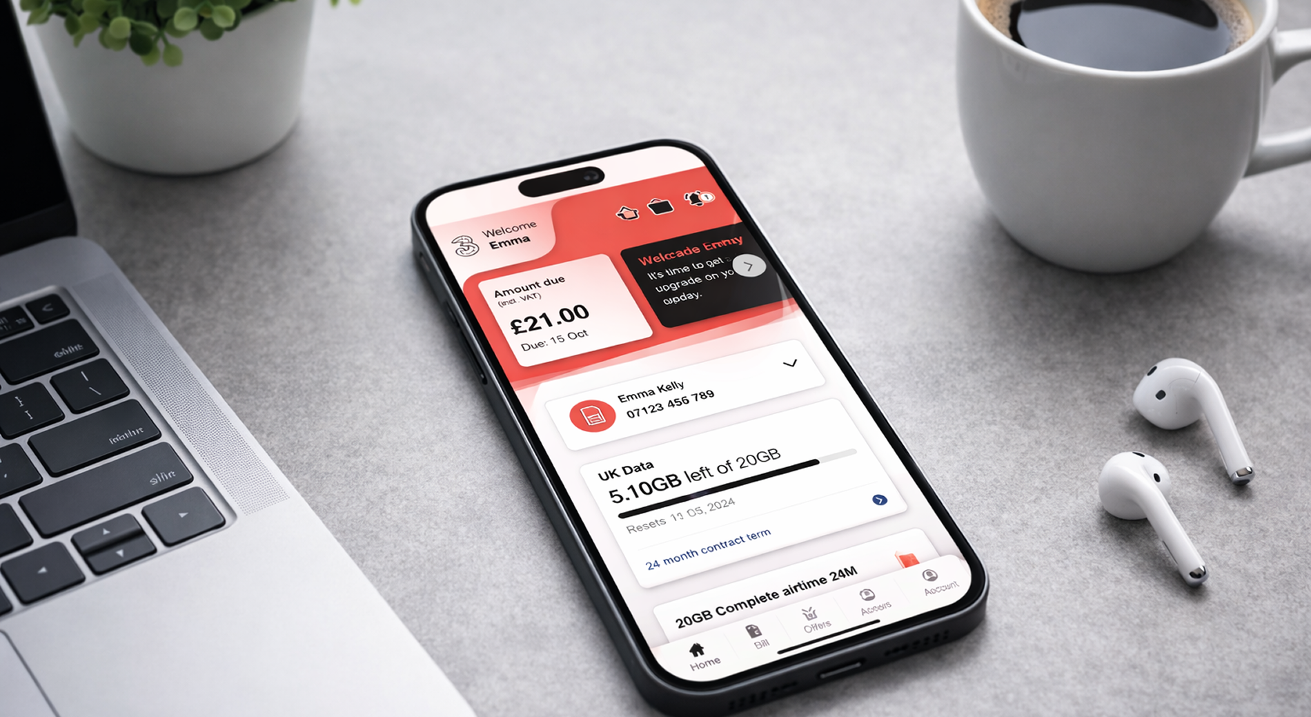
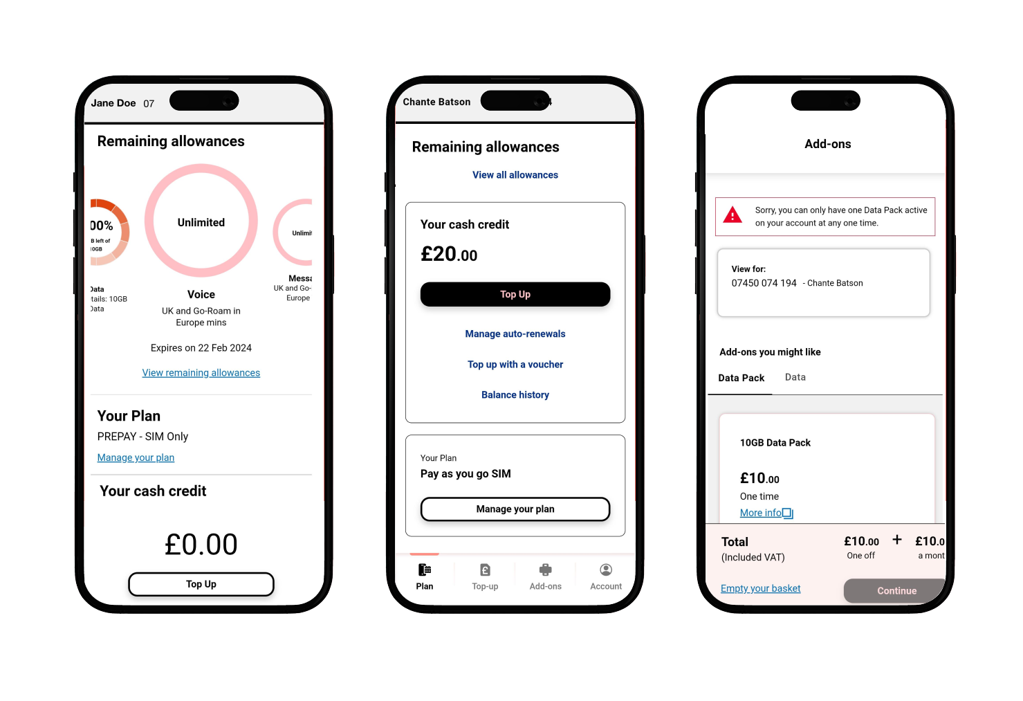
Cleaned up navigation and account and subscription management
Improved UI visuals to explain the users accounts and usage
Delivered a concept for a ‘user timeline’ this was a new core element to help orientate users to whats most useful and pertinant and different tomes in their life cycle, allow them clear awareness of their bill, delivery, as well as using it to highlight upgrade or sales opportunities
Improved exposure of Three’s separate rewards app, fast forwarded the plan to later integrate that into a single app
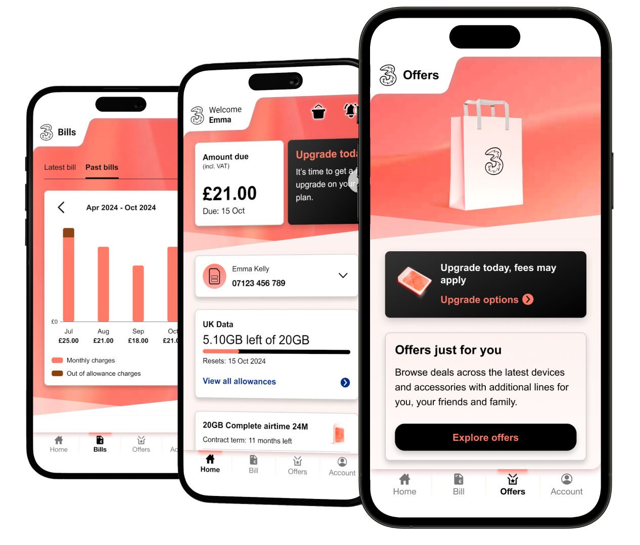
Example screens of the refreshed app
Research led.
Running along side design we created a prototype using Figma which allowed our research team to test immediately.
13 customers completed common journeys including billing, upgrades, account management and rewards using a mobile Figma prototype.
Overall outcome
The prototype was considered a significant improvement over the current app and users reported they would be satisfied even without further changes.
The new design successfully:
Matched customer expectations of where information should live
Allowed users to navigate without instruction
Made billing and account management easy to understand
Increased interest in the Three+ rewards ecosystem
The remaining problems were not usability failures but choice overload and decision confidence, especially in upgrades and add-ons.
Usability & Learnability
100% of participants used the app without instruction
Users quickly completed most key journeys
Users could recall feature locations after a short session
Users recovered from errors independently
All participants reported high satisfaction and considered it a major improvement over the existing app
Visual design matched brand expectations
The research validated and justified our core design decisions, demonstrating that the information architecture aligned with user expectations and that key journeys could be completed intuitively without instruction. Feedback confirmed the design choices, clearer hierarchy and integrated rewards model improved comprehension confidence and overall satisfaction, while highlighting remaining opportunities around decision support rather than usability.
This provided evidence-based direction for build and prioritisation.
Current status
The app went live with confidence from the research.
Benefits driven from the new design
Improved Android app rating by 21%
Improved iOS app rating by 38%
Refreshed app accounted for 20% of contract handset growth and 25% of SIM only growth over Black Friday 2025
Data pack journey improvements contributed to over a £100K increase in the 1st month alone, as well as a 65% Add-on sales increase.
The ‘user timeline’ worked well though the business decided to prioritise this as a sales tool which deviates from the original intention and directly against what customers asked for so time will tell on the long term effects of that change.